the octopus grew up, and it is still an octopus
outl has a new logo. The cartoon octopus with glasses and an Esc keycap is replaced by a flat silhouette on a 91 by 128 grid: a head with 21 unit corners, a short stub and three tentacles, all cut at the same slope, atan(3/5), which is 30.96 degrees. The post walks through the real numbers (the widths 25, 18 and 13, the lime tip on the dark theme, the 56% mark on the app tile, the contrast ratios), says what the new mark gave up, and notes that the site already wears it while the app icons on every client ship in the next release.
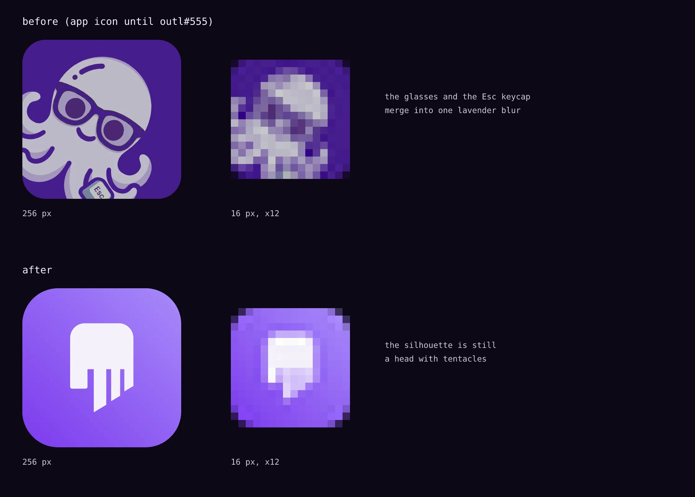
At 16 pixels the old outl logo was a lavender smudge. I scaled it down and looked: the glasses and the Esc keycap, the two things that made it that octopus and not any octopus, merged into one blob with no features.
The old mark had been in use since June 2026. A pale lavender cartoon octopus with nerdy glasses (green-rimmed on the site, the figure below shows the app icon version), a smile, an Esc keycap held in its tentacles, all on a violet rounded square. The social cards used a ›_ prompt as the brand. I liked it, and it was also childish, and the thing it sat on top of is a tool that holds years of someone’s notes. The new mark keeps the octopus and drops everything that was acting.
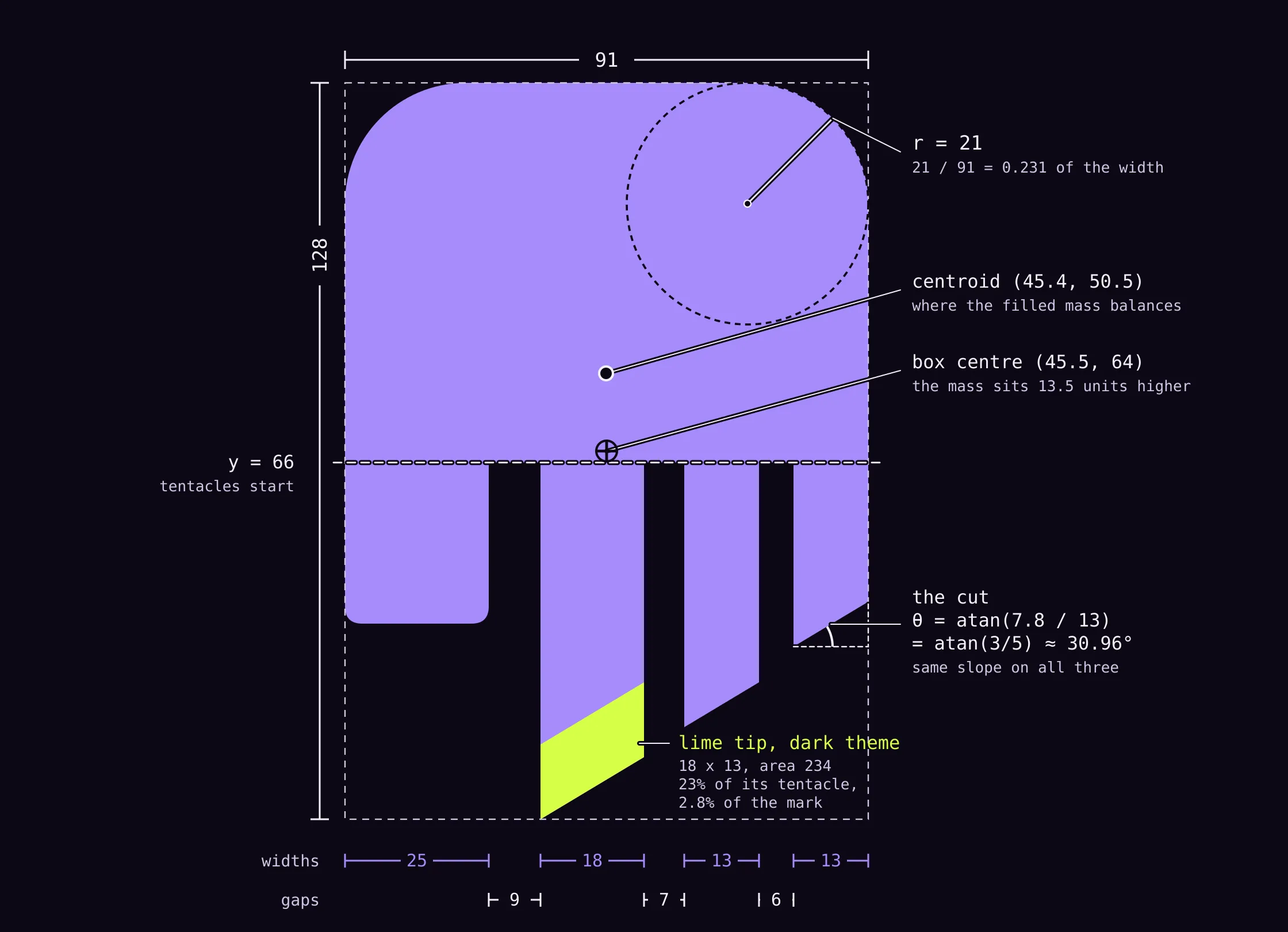
Everything below is read off that drawing. The two paths live in src/lib/brand.js of this repository and the same numbers sit in scripts/gen-icons.py of the app repository, so the figure is the real geometry, not a redraw.
the head is 91 wide, and its corners are the tile’s corners
The head is a rounded rectangle with a circular arc of radius 21 at each top corner. That is 21 / 91 = 0.231 of the head’s width. The app tile is drawn with a corner radius of 0.225 of its side (RADIUS_RATIO in the icon script, gen-icons.py), so the head and the tile it sits on have nearly the same corner proportion, 23.1% against 22.5%. Same shape of corner, one scale apart.
The whole mark is 91 by 128. 128 / 91 = 1.4066, which is within 0.54% of the square root of two, the ISO 216 paper ratio. I am not claiming the grid was derived from it. It is what the numbers came out to, and a sheet of A4 has the same proportion.
Under the head, a short stub on the left drops to y = 94, 25 wide, with two small quadratic corners of size 3. Everything else hangs from the line at y = 66.
three tentacles, and two progressions that almost hold
The widths read left to right are 25 for the stub, then 18, 13 and 13 for the tentacles. The gaps between them are 9, 7 and 6. The first three widths are nearly a geometric sequence:
25 / 18 = 1.389
18 / 13 = 1.385
A ratio of about 1.39 twice, and then the last tentacle stops at 13 instead of shrinking again. So “nearly”, and only for the first three.
The lengths are a different story. Measured from y = 66 to the midpoint of each cut, the tentacles are 56.6, 42.1 and 28.1 units long. The steps between them are 14.5 and 14.0, so the lengths are nearly an arithmetic progression with a step of about 14. As ratios they would be 1.34 and 1.50, which is not geometric at all. So the widths shrink roughly by a factor and the lengths shrink roughly by a step.
one slope for every cut, and it is 3/5
Every tentacle ends in a slanted cut, and all three cuts have the same slope. The drop is 10.8 over the 18 unit tentacle and 7.8 over each of the 13 unit ones:
10.8 / 18 = 7.8 / 13 = 3/5
θ = atan(7.8 / 13) = atan(3/5) ≈ 30.96°
The cuts are parallel, not collinear: each one is shifted down to make its tentacle the length it is. One angle keeps the three tentacles reading as cut from the same stock, and it makes the cut the one part of the mark you can describe with a single number.
the lime tip is the only thing that is not lavender
On the dark theme the end of the longest tentacle is lime, #d6ff47. It is a parallelogram 18 wide and 13 tall, cut at the same 3/5 slope. Its area is 234 grid units, 23% of the tentacle it sits on and 2.8% of the whole mark. The 13 is the width of the two shorter tentacles, so the tip’s height is already a number the mark uses.
On the light theme the tip is painted the same violet as the rest, with no lime at all. It is an accent for the dark surface, and I will say below what it does not do.
56% of the tile, and the weight sits above the middle
In the app icons the mark’s height is 56% of the tile (MARK_SCALE = 0.56). On a 1024 pixel tile that is 573.4 by 407.7 pixels, and because the silhouette fills about 72.5% of its own bounding box (8445 of 11648 grid units, arcs included), the mark covers about 16.2% of the tile’s area.
The icons centre the bounding box, and the filled mass is not at the centre of its bounding box. The centroid is at about (45.4, 50.5) while the box centre is at (45.5, 64). The visual weight sits about 13.5 units above the box centre, which is 10.6% of the mark’s height, or about 61 pixels on a 1024 tile. The head is heavy and the tentacles are light, so the mass rides high. An optical centre is conventionally a little above the geometric one, and the icons centre the bounding box without compensating for the mass, so the head sits a little above the middle of the tile.
each platform gets its own grid, and the mark fits all of them
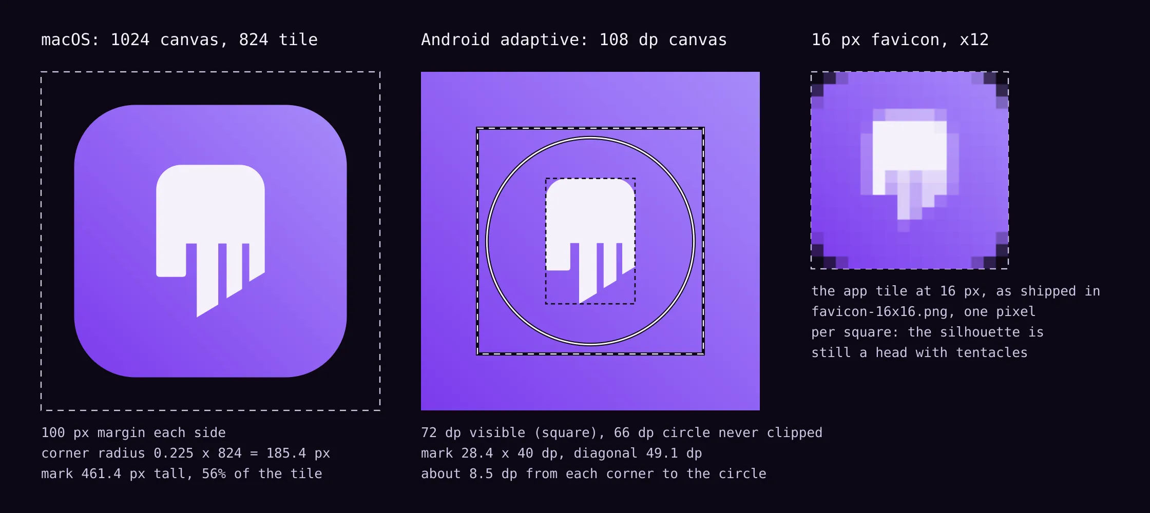
The tile is a diagonal gradient from violet at the bottom left to lavender at the top right, with the mark in paper (#f4f1fa). What changes between platforms is the container.
- macOS: a 1024 canvas with an 824 tile, so 100 pixels of transparent margin on each side, which is the body size in Apple’s icon template. The corner radius is
0.225 x 824 = 185.4pixels and the mark is 461.4 pixels tall. The icon script draws circular-arc corners, and Apple’s own shape is a continuous-curvature squircle, so I am not claiming the outline matches Apple’s curve exactly. - iOS and the App Store: an opaque full square. The OS applies its own mask.
- Windows and Linux: a rounded tile, full bleed, no margin.
- Android: an adaptive icon on a 108 dp canvas, of which 72 dp is visible and a 66 dp circle is guaranteed never to be clipped. The mark is 40 dp tall, so 28.4 by 40 dp. Its bounding box diagonal is 49.1 dp, which leaves about 8.5 dp between each corner of the box and the edge of the safe circle. Android 13 and later also get a monochrome layer.
Raycast, the DMG background and the README get the same mark in the same palette.
contrast, held to a bar that logos are exempt from
WCAG exempts logos from its contrast rules. I held the mark to the non-text bar of 3:1 anyway, because it is the bar a reader would use on an icon. The formula is the plain one, from relative luminance L:
contrast = (L1 + 0.05) / (L2 + 0.05)- Dark site, lavender
#a78bfaon ink#0c0814: 7.28:1. The lime tip on ink: 17.21:1. - Light site, violet
#7c3aedon the light background#faf8ff: 5.41:1. - App tile, paper on violet: 5.10:1. Paper on lavender: 2.44:1.
That last number is the weak end of the gradient, and the mark does not sit on the pure ends. Under the mark itself the background runs from 3.03:1 to 4.03:1, so every pixel of the mark sits at 3:1 or better against what is behind it. SVG interpolates gradient stops in sRGB by default, which is what the icon renderer uses, and those numbers are computed the same way.
why an octopus: its arms decide a lot on their own, as a metaphor
This is a metaphor, and I mean it as one. An octopus has roughly 500 million neurons, and about two thirds of them are in the arms rather than the central brain (Hochner, 2012). The arms can carry out actions with little central input, and much of that has been observed in arms that were removed from the animal (Lab Animal). Learning happens centrally, but the information the brain uses to choose comes from the arm (OIST, 2020).
outl is local-first in the same shape. Each device holds the whole workspace and works on its own, offline, and sync between your devices coordinates them instead of commanding them. The mark does not draw eight arms. It draws a stub and three tentacles, which is a stylisation, and I would rather say that than let anyone count.
the site wears it today, the apps get it in the next release
- Site: the navigation, the footer, the favicons, the touch icon and the social cards already use the new mark (outl-site#55). The social cards used to carry the
›_prompt. - Desktop (macOS, Windows, Linux), iOS, Android, Raycast, the DMG background and the README: merged in the app repository (outl#555) and in the next release. Until you update, an installed app still shows the old icon.
what it gave up
It has less personality than the cartoon. A flat silhouette cannot wink. That was the point, and it is still a cost: the old octopus was recognisable at a glance as a character, and the new one has to earn its recognition as a shape.
The lime tip reads by hue and not by brightness. Lime against lavender is 2.37:1, which is below the bar I held the rest to, so someone who cannot tell the two hues apart sees one lavender shape with a slightly different end. The mark still works as a silhouette without it, and on the light theme the tip is painted the same violet as the body, so there is no accent there at all.
On macOS the tinted icon mode is not wired. It needs actool or Icon Composer in the build, and the pipeline does not have either yet, so it waits.
The files are in assets/brand/ in the outl repository and the geometry is in src/lib/brand.js of this site.